zoup
Member
- Joined
- Feb 21, 2024
- Messages
- 28
- Reaction score
- 88
- Points
- 13
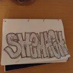
dope letters manThat's some quality stuff!
One thing I always try to do is keep all my letters the same size. And I'm big into symmetry. So for that one, I would shrink the R just a little, bump it up and arch that one extension out to mirror the extension the back of your P.
Like so:
View attachment 377
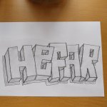
 R looks like booty
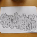
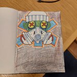
I like that ERRandom speed doodle at work, way out of my element
Dope letters. Really like the letter 'Z'. Imo I would add another arrow facing the right side on the first bar of the letter 'R' to fill in the negative space.Random speed doodle at work, way out of my element
Yeah there was going to be a K on the end after the R, but I never finished itDope letters. Really like the letter 'Z'. Imo I would add another arrow facing the right side on the first bar of the letter 'R' to fill in the negative space.
When it comes to the letter 'E', I started to have a similar letter style, however I usually struggle with the middle part. Sometimes, I prefer lowercase letter 'E' depending on the flow.

You should!Yeah there was going to be a K on the end after the R, but I never finished it

That is some premium stuff there. I love love LOVE everything except for the tiny eye and mouth on the "A." I feel what you were going for there, but it feels kind of tacked-on. Contrast that with the eye on the "E," which I think works great. I don't know how, but I would have re-worked that one single element. But it's not a deal-breaker by any means, and I have devoted far more text to it than it deserves as crit.AZIEL for a reddit challenge , can't decide if I want to fill the letters or be lazy and leave it as is. Only have felt tip pens at work so fills are a pain
View attachment 2242
I appreciate the input either way! I get what you're saying though and I agree it probably could have been reworked a bit. Thanks bro!That is some premium stuff there. I love love LOVE everything except for the tiny eye and mouth on the "A." I feel what you were going for there, but it feels kind of tacked-on. Contrast that with the eye on the "E," which I think works great. I don't know how, but I would have re-worked that one single element. But it's not a deal-breaker by any means, and I have devoted far more text to it than it deserves as crit.