- Joined
- Feb 8, 2024
- Messages
- 1,210
- Reaction score
- 823
- Points
- 113
- Location
- City of Lost Children
- Website
- www.bangyard.com


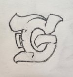
I feel like it looks pretty good honestly, round letters like that are definitely tricky for vantage point 3D. Looks pretty solid to me though.I decided to do my first blackbookology entry, however I'm not sure on the vantage point inside the letter 'Q'. It seems off and it bothers me. When it comes to round letters(ex: C,O,G) and vantage points what is the proper way of doing it.
I decided to do my first blackbookology entry, however I'm not sure on the vantage point inside the letter 'Q'. It seems off and it bothers me. When it comes to round letters(ex: C,O,G) and vantage points what is the proper way of doing it.
Thank you for the tip. Circling back to the upper part of the Q, my vantage point in at the bottom tip of the letter 'i' I forgot to mention it previously, so in that case I believe that the 3D wouldn't be there on the upper part of Q because its parallel. Correct me if I'm wrong, otherwise I'll go back and check my mistake.I feel like you should also add the 3D to the upper part of the Q to stay consistent.
A trick you can use is to take tracing paper, trace over the image and then move it to where you want to focus the perspective. That's where your 3D should be. If you are going for a centered/fixed point, move the trace to one side, make marks, then move it to the next side.


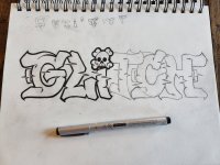
Make the K's more like your handstyle and I think you will see an improvement.I have come to the conclusion that I don't like K's as much as I though I would. Lol I need to sit down and actually sketch one of these days. Just a couple quick pen concepts trying out the word ZERK. 3rd one has promise minus the K I fucked up lol

That's some quality stuff!

Ooh yeah I like that, I have a bad habit of making uneven letters if I don't draw a guide line lolThat's some quality stuff!
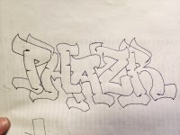
One thing I always try to do is keep all my letters the same size. And I'm big into symmetry. So for that one, I would shrink the R just a little, bump it up and arch that one extension out to mirror the extension the back of your P.
Like so:
View attachment 377